It hasn’t reflected publishing standards since the Jazz Age. And it isn’t Chicago style. But some people continue to do it in their own documents—from manuscripts to emails. You’ll even see it occasionally on social media.
I’m talking about the habit of typing two spaces between sentences.
Where did this practice come from, and why does it persist?
To get some answers, we’ll start by looking at how Microsoft Word handles this convention, and what that might say about English versus other languages.
Then we’ll take a brief detour to the past to find out how we arrived at the present.
MS Word’s Punctuation Conventions
Word can police your sentence spacing if you ask it to. You’ll find this option by digging into a category of settings deep inside Word’s proofing options.
To get there, navigate to File > Options > Proofing, where you’ll find an option to adjust the settings for Word’s grammar checker (under “Writing Style”).
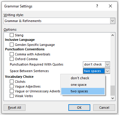
In the Grammar Settings dialog box, scroll down to Punctuation Conventions. There you should find Space Between Sentences, which includes the following options: “don’t check,” “one space,” “two spaces.”

If you set this option to either “one space” or “two spaces,” you’ll get a warning at the end of sentences that violate the respective rule—either as you type or when you run the grammar checker.
But this setting is designed mainly with two-spacers and their end-of-sentence exceptions in mind; thanks to Find and Replace, one-spacers don’t need the extra help.
Find and Replace: A One-Spacer’s Best Friend
Word’s Find and Replace can easily get rid of any instance of two or more spaces anywhere in your document. Just type two spaces into the Find field and one into the Replace field. Then click Replace All, repeating this step until Word can’t find any remaining instance of two consecutive spaces.
Even in the longest of documents this should take no more than a few seconds.
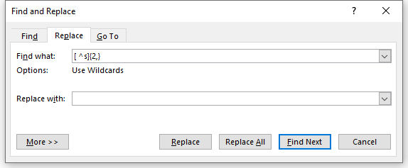
If you use Word’s wildcards feature (a variation of the regular expressions used for pattern matching by programmers), you can do it all in one click.
Enter [ ^s]{2,} in the Find field (note the space after the opening bracket) and exactly one space in the Replace field. This will find all instances of at least two consecutive spaces, including any nonbreaking spaces (^s), and replace them each with a single space. Click Replace All—et voilà: you’re done. (For a detailed manuscript cleanup checklist, including some caveats, see CMOS 2.80 [17th ed.].)

If you’re a two-spacer, on the other hand, you’re better off leaving the space-checking option on. Word may not flag all your errant spaces, but it’s pretty good at recognizing exceptions like “Dr.” in the middle of a sentence (where two spaces would not follow the period), so it should catch most.
What about Spanish and French?
Word includes proofing tools for many languages besides English. (The proofing tools are what enable both spelling and grammar checking.)
I normally use the default English-language tools for my English-language installation of Word. But I wanted to see if Word’s two-space option extended to other languages.
Spanish and French are typographically very similar to English. Like English, both languages use the Latin alphabet, and they’re also punctuated very much like English. That includes periods (or question marks or exclamation points) at the ends of sentences. So I started there.
The grammar settings for Spanish and French are similar to the options for English and include most of the main categories.
But neither Spanish nor French includes an option for spaces between sentences—or a category for punctuation conventions. Translation: Spanish and French follow a one-space convention.*
From Quixote to Rousseau
Extra space between sentences was the convention in English-language publications for centuries, as we’ll see in a moment. But what about Spanish and French?
To find out—and to get an idea as to whether Word’s lack of a sentence-spacing option for Spanish and French might mean anything—I looked at some famous old books. While not definitive, the pages in these books suggest that extra space between sentences wasn’t the convention in either French or Spanish.
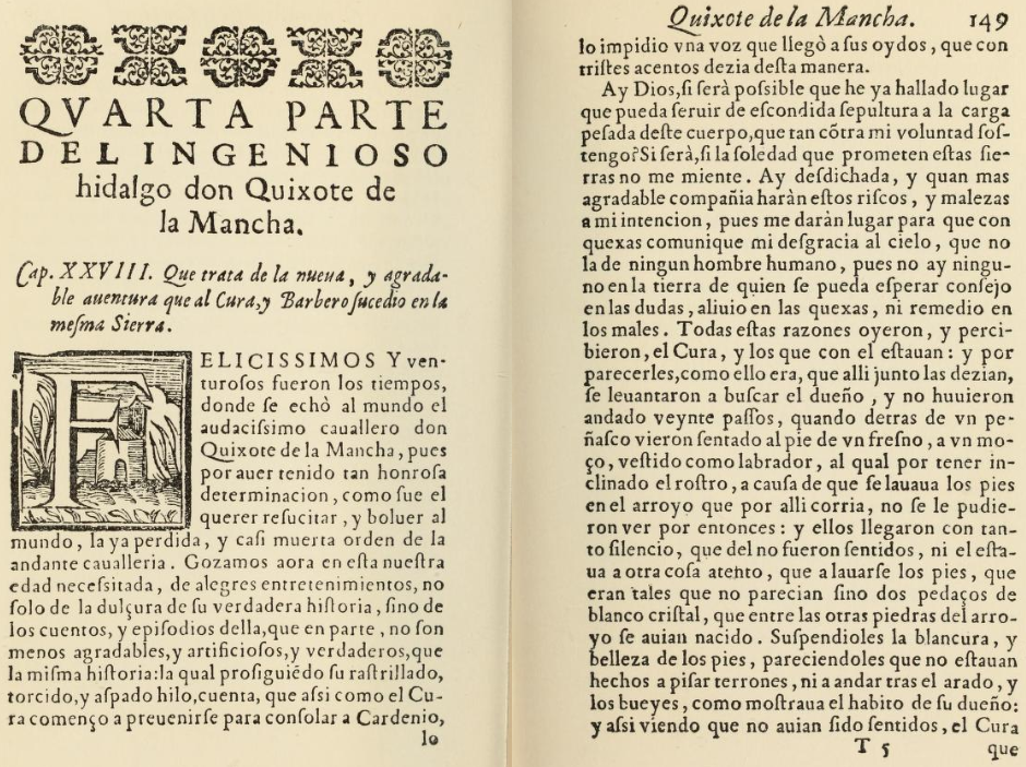
See, for example, the original edition of Don Quixote, the first part of which was published in Madrid in 1605.

You’ll find mostly uniform spacing in each line of Cervantes’s text—including between sentences—though the spacing is a little erratic, especially where lines have been squeezed to fit. And note the spaces before commas and periods.
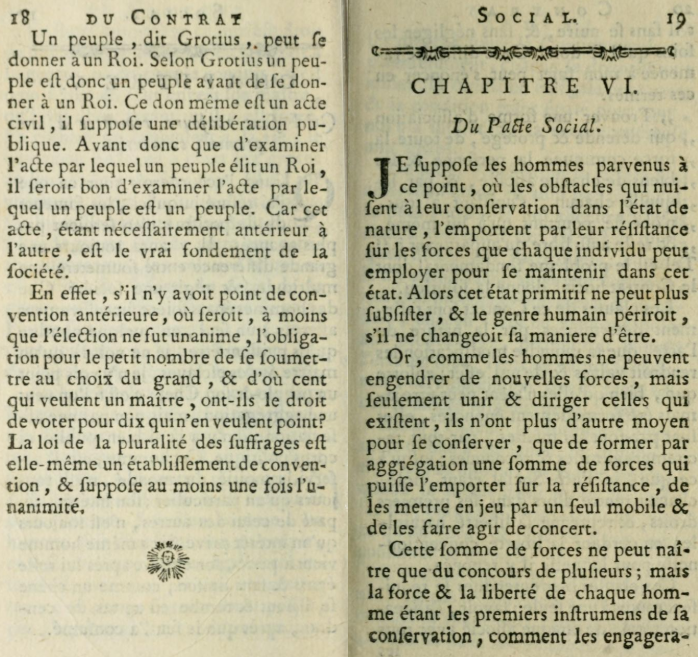
For an early example in French, see Rousseau’s Social Contract, published in Amsterdam in 1762.

The spacing in the Rousseau is similar to that of the Cervantes: equal space across each line—including before commas (but not periods), a convention that persisted in French into the twentieth century.†
Spaces aren’t used before commas anymore, but spaces are still used in French before most other marks of punctuation. You can see this for yourself. If you switch to French proofing tools in Word, you’ll automatically get a space before a colon, a semicolon, a question mark, and an exclamation point.
Ye Olde Spacing in English
Now let’s look at English.
Henry Beadnell’s influential Guide to Typography, published in London in 1859, advised using an em space after a sentence that ends in a period: “after a full-stop, an em quadrat” (pt. 2, p. 43). An em space, so-called because it is about the width of a capital M, was three times the size of the space typically used between words.
This would be the advice also in the first edition of our very own Manual of Style (1906):
A standard line should have a 3-em space between all words not separated by other punctuation points than commas, and after commas; an en-quad after semicolons, and colons followed by a lower-case letter; two 3-em spaces after colons followed by a capital; an em-quad after periods, and exclamation and interrogation points, concluding a sentence. (¶ 245)
A 3-em space is one-third of an em space (“3-em” is short for “three to an em”). So printers in those days were putting not two but three times as much space between sentences as between words.
That was old news by 1906. You’ll see extra space between sentences in the 1611 first edition of the King James Bible. You’ll also see it in Jane Austen’s Sense and Sensibility as first published in London in 1811.

The extra space between sentences is obvious in the Austen example. (And note the catchwords at the bottom of each page, a convention featured also in Quixote.)
The End of Big Spacing
These prodigal English-language spacing conventions would end by the middle of the twentieth century.
The eighth edition of Chicago, published in 1925, updated its advice to recommend an en space—or half an em—between sentences (and after colons). That’s like one and a half spaces.
But it was the eleventh edition, published in 1949, that was the first edition of Chicago’s Manual to advise equal spacing everywhere:
The standard for composition such as that in the text of this book would be a 3-to-em space, with the same spacing as between words, after colons, after exclamation and interrogation points, and after periods ending sentences unless special instructions are given. (p. 8)
The Linotype and Monotype machines that had been replacing the more selective process of setting type by hand probably had something to do with this.
But for the persistence of two spaces, we need to look at the typewriter.
Typewriters; or, Imitation Is the Sincerest Form of Flattery
The English-language publishing conventions that were in place when typewriters first became commercially viable, in the 1870s, were almost certainly responsible for the corollary convention of literally typing two spaces after a period.
In other words, typists were using the space bar to mimic the publishing standards of their day.
But there’s an old and persistent myth that the monospaced fonts typical of typewriters are somehow responsible for the two-space rule. The idea is that monospaced fonts, in which every letter and mark of punctuation occupies the same amount of space on a line, need that extra space after a period to be legible.
But that argument makes almost no sense.
As we’ve seen, the convention of extra space between sentences was established for the proportional fonts used by printers—the same fonts on which many of today’s professionally designed typefaces are modeled—long before typewriters and their monospaced fonts were even a thing.
Meanwhile, computers have transformed publishing and typesetting—and how documents are cleaned up and edited. But typing is the same as it ever was (right down to the QWERTY keyboard). If I want a space, I press the space bar (physical or virtual); if I want two, I press it again.
If the two-space habit persists, that’s because our modern keyboards allow it to.
And because some people prefer two spaces.
If You Prefer Two Spaces . . .
Those who continue to use two spaces between sentences say it helps them to read, and according to a recent study, they’re not wrong. The study, published in 2018, found that people who already use two spaces between sentences in their own work read a bit faster when a text includes these spaces.‡
But the extra spaces didn’t help one-spacers, nor did the spaces improve reading comprehension for either group.
Still, there’s nothing inherently wrong with a preference for extra space between sentences, or the convention wouldn’t have taken hold in the first place.
. . . Your Editor Will Eliminate Them
I love cleaning extra spaces out of manuscripts. It’s so satisfying, and so easy to do.
But I wouldn’t be all that thrilled if I had to enforce the two-space rule—especially across a complex book-length manuscript. Just the thought of having missed an exception somewhere in the text, even with Word on my side, would keep me up at night.
So don’t expect publishers or their editors to enable your two-space habit, as virtuous as it might be. And we’re not about to return to the golden era of em spaces between sentences either.
I, for one, would rather tilt at windmills.
* I also checked German while I was at it (I had to install the German language pack first), and there’s no option for checking spaces between sentences in German either.
† Hart’s Rules, the style guide for Oxford University Press, added for its nineteenth edition, published in 1905, the following footnote in its section on French: “The English practice, never to put a space before a comma, is regarded by the best French printers as bad. ‘This vicious practice’ (i.e. putting no space before a comma), says M. Théotiste Lefevre, ‘which appears to us to have no other motive than the negligence of the compositor, tends unhappily, from day to day, to get introduced also into French composition.’—Guide pratique du compositeur et de l’imprimeur typographes (p. 196 n.), par T. Lefevre. Paris, Firmin-Didot, 1883.—H.H.” (p. 59).
‡ Rebecca L. Johnson, Becky Bui, and Lindsay L. Schmitt, “Are Two Spaces Better than One? The Effect of Spacing following Periods and Commas during Reading,” Attention, Perception, & Psychophysics 80 (2018): 1504–11. The article begins by noting that APA style requires two spaces after a period in manuscripts, but that ruling was reversed for the seventh edition of the APA manual, published in late 2019.
Top image: Honoré Daumier, Sancho Panza and Don Quixote in the Mountains, 1866 or 1868 (WikiArt).
Editor’s Corner posts at Shop Talk reflect the opinions of its authors and not necessarily those of The Chicago Manual of Style or the University of Chicago Press.
~ ~ ~
 Russell Harper (@cpyeditor) is editor of The Chicago Manual of Style Online Q&A and was the principal reviser of the last two editions of The Chicago Manual of Style. He also contributed to the revisions of the last two editions of Kate L. Turabian’s A Manual for Writers of Research Papers, Theses, and Dissertations.
Please see our commenting policy.


Have you ever used your method in a document with tables or other elements that uses spaces for other alignment applications?
Yes, but for anything other than a simple table, it can be a good idea to do the cleanup in a separate step (see step 5 in the cleanup checklist at CMOS 2.80 [17th ed.]). If extra spaces were used to approximate the formatting, these will usually need to be stripped out and reconfigured with indents or decimal and other alignment values for publication—and to ensure that the formatting survives conversion to InDesign, HTML, etc. along the way. Tables are definitely a special case. 🙂
Thanks. I didn’t realize that the context of the advice was only for preparation for publication. My comments were for general use.
Two spaces — a relic of the monospaced typewriter age. I don’t see why people cling to that habit.