Anyone familiar with the grammar and style rules and guidelines in CMOS knows they come with a lot of qualifiers: normally, in most cases, in running text, in regular prose, depending on the context—I could go on and on. In life, very few rules are meant to cover every situation. The same is true in CMOS.
This is especially so when it comes to writing and editing marketing copy, something more and more authors are doing for themselves. Indie authors often design their own book covers and ads and write their own press releases. A few weeks ago we looked at the liberties we take when writing or editing blurbs. This week we’ll consider more visual types of promotion.
Form versus Function
In publishing, book covers, posters, and ads depend on eye appeal for their effectiveness, and sometimes graphic design ends up clashing with formal editing rules. Chicago style for referring to a book title and subtitle (CMOS 8.164 and 8.168 [17th ed.]) is to use headline caps, italicize the whole thing, and put a colon after the title, like this: Shades of Black: Crime and Mystery Stories by African-American Writers. Titles that happen to be sentences (I Capture the Castle) don’t take a period at the end unless they fall at the end of a sentence: “The teacher assigned I Capture the Castle.”
But how often do you see a colon on the cover of a book? Or an italic title, or one with everything in Chicago-style headline caps? Even CMOS recognizes that there’s no point in legislating display styles (CMOS 8.157 and 8.165 [17th ed.]). Graphic designers play with punctuation and capitalization; they spell out numbers or they don’t; they mix fonts and styles. Instead of using a period or a comma, they signal transitions and pauses with line breaks, color, or any number of visual techniques.
On this cover for the short-story anthology Shades of Black, there’s no colon after the title; the title is all lowercase in a mix of black and white type; and the subtitle is in title case in smaller yellow type (click on this or any book cover in this post to enlarge):
The subtitle of Courtney Maum’s Before and After the Book Deal has lots of commas, but this cover design by Sarahmay Wilkinson substitutes line breaks and checkbox bullet points for commas:
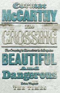
The freedom available to graphic designers is made obvious by the extreme variation we often see in different editions of the same book. In these two cover designs for Cormac McCarthy’s The Crossing, the blurb from a Times review receives two very different treatments:
Neither is standard running-text style: In the design on the left, the quotation is presented in small, all-caps type in the upper-left corner. In the other design (by David Pearson), the blurb takes up half the cover in huge, stylized type with mixed capitalization. Both include the colon; neither ends with a period. Which is more effective? You’d have to take a poll.
Of course, about the time a copyeditor learns that punctuation is omitted in display because it’s intrusive and clunky, a designer might be wondering, “What rule can I break next?”
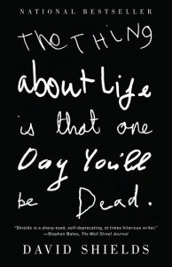
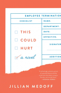
These three books show playful styling of a title:
On the cover of David Shields’s The Thing about Life Is That One Day You’ll Be Dead, designed by Keenan (“cover lettering by Ruby, Ella, Richard, Loulla and Albert”), capitalization is mixed, some words are bolded, and the title ends with a period to convey, the author told me in an email, “the finality of death.” The title on Umberto Eco and Jean-Claude Carrière’s This Is Not the End of the Book fills both front and back of the dust jacket in huge type, the word “not” is italic, and the sentence-cased title ends with a semicolon—clearly no finality there.
The jacket for This Could Hurt by Jillian Medoff, designed by Joanne O’Neill, features three empty checkboxes to the left of the stacked three-word title, something like the boxes Wilkinson chose for the Maum cover we saw above. Wilkinson used them to convey a subtitle’s intended pauses and to suggest a series of tasks. However, O’Neill’s checkbox bullets are more subversive, bringing an emphasis to each word that is not inherent in the title, the unchecked boxes portending one blow after another.
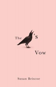
It seems there’s no limit to graphic-designer hijinks. Here’s a cover where the reader is left to guess the complete title of the book (The Crow’s Vow, by Susan Briscoe):
It would be fun to know what kinds of discussion all these covers and jackets inspired during production. Did the editors and copyeditors jump on board with the designs right away? Were the writers’ opinions sought and regarded? Whatever the case, these are the kinds of issues writers and editors should expect to negotiate with an open mind. Insisting on “correctness” for its own sake would be counterproductive.
Made You Look
Some of the most famous ad campaigns in history went beyond messing with punctuation to break with standard grammar. I don’t have to remind you of “Winston Tastes Good Like a Cigarette Should” or the “Got Milk?” campaign.
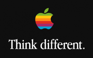
Apple’s 1997 “Think Different” slogan, credited to art director Craig Tanimoto at the advertising agency Chiat\Day,* caused a storm of consternation. But why? No one in the 1957 movie Funny Face objects to the “Think Pink” ad campaign, although it’s grammatically the same: an imperative verb followed by an adjective.

The “Think Pink” musical number from the movie Funny Face.
Is it because the adverb “differently” (unlike “pinkly”) exists and is commonly paired with “think” that we assume the use of the adjective breaks a rule? If Apple had decided on “Imagine different” or “Picture different,” or if they had used quotation marks,
Think “different.”
the usage wouldn’t have startled us. But then, startling us was the point. In the past, such rule-breaking slogans scandalized grammar sticklers and whipped up publicity—if not actual sales—beyond their creators’ dreams. Today, commands like “Spread the Happy” and “Let’s Beauty Together” somehow don’t muster the same wow power. I’m not worried. I’m confident marketing copywriters and graphic designers can come up with ever more amusing ways to inspire us to click and buy.
How Much Is Too Much?
Consumers can have strong reactions—positive and negative—to rule-breaking. A 2013 survey showed that poor grammar and spelling were the top turnoffs to advertising consumers over the age of twenty-four.† Thus marketers and editors must always weigh the attention-getting benefits of an unconventional approach against the publisher’s greater mission and reputation.
In this regard, the primary goals of marketers and editors are not always compatible. While the marketer wants to capture attention, the editor must protect the integrity of the text, stepping in when a promotional detail causes trouble for readers. An editor might rightly object to omitting a hyphen that’s needed for sense or point out a line break that leaves the wrong words grouped. In all-lowercase text, an editor might push for capping a proper name that could be mistaken for a common noun if lowercased.
Always, the tastes and habits of the consumer/reader/buyer will help drive the decision. A campaign succeeds when it disrupts expectations enough to delight and not enough to annoy.
Caveat
Although ad copy may be creative and rule-breaking, copy for submission queries, pitches, cover letters, and press kits that go out to editors, journalists, agents, reviewers, and producers is more akin to copy for a business letter. Such materials are usually written more sedately, with careful attention to grammar and styling consistency. They signal that the sender is a responsible person worthy of a contract. That’s not to say voice and creativity have no place in these documents—just that clarity and conciseness are more important.
* Patrick Hanlon, “Meet the Man Who Saved Apple,” Forbes, December 6, 2015.
† Those under twenty-four were most bothered by a failure to update often enough. “What Customers Hate about Your Social Media Channels,” Disruptive Communications, August 7, 2013.
Top image of bullhorn with shopping cart (modified for post), courtesy Wallpaper Flare.
Book covers and dust jackets: Courtney Maum, Before and After the Book Deal: A Writer’s Guide to Finishing, Publishing, Promoting, and Surviving Your First Book (New York: Catapult, 2020); Shades of Black, ed. Eleanor Taylor Bland (New York: Berkley Publishing Group, 2004); Cormac McCarthy, The Crossing (New York: Picador, 2007); Cormac McCarthy, The Crossing (London: Pan Macmillan, 2010); David Shields, The Thing about Life Is That One Day You’ll Be Dead (New York: Vintage, 2009); Umberto Eco and Jean-Claude Carrière, This Is Not the End of the Book: A Conversation Curated by Jean-Philippe de Tonnac, trans. Polly McLean (London: Harvill Secker, 2011); Jillian Medoff, This Could Hurt (New York: HarperCollins, 2018); and Susan Briscoe, The Crow’s Vow (Montreal: Signal Editions, 2010).
“Think different” logo for Apple Computer Inc., Rob Janoff (stylized apple) and Craig Tanimoto (text), 1997, courtesy Wikimedia Commons.
Detail of film still featuring Suzy Parker from Funny Face, directed by Stanley Donen (Hollywood, CA: Paramount Pictures, 1957), 0:05:19, Amazon Prime Video.
Fiction+ posts at Shop Talk reflect the opinions of its authors and not necessarily those of The Chicago Manual of Style or the University of Chicago Press.
~ ~ ~

 Carol Saller’s books include The Subversive Copy Editor and the young adult novel Eddie’s War. You can find Carol online at Twitter (@SubvCopyEd) and at Writer, Editor, Helper.
Sign up for Carol’s email updates.
Please see our commenting policy.


